Branding
Branding
We use the term “branding” to describe the mechanism for contextual changes in the design of our components. Branding means we can use the same component across different sections, and allow it to take on the styles of that section. We use this to apply Team colours and font changes to components - showing them as blue in the men’s section where they would be red in the women’s as an example.
Reference: https://www.figma.com/file/R4Ueh8kR6GJSRI0UvhIh6Y/Master-Working-File?node-id=8885%3A398622
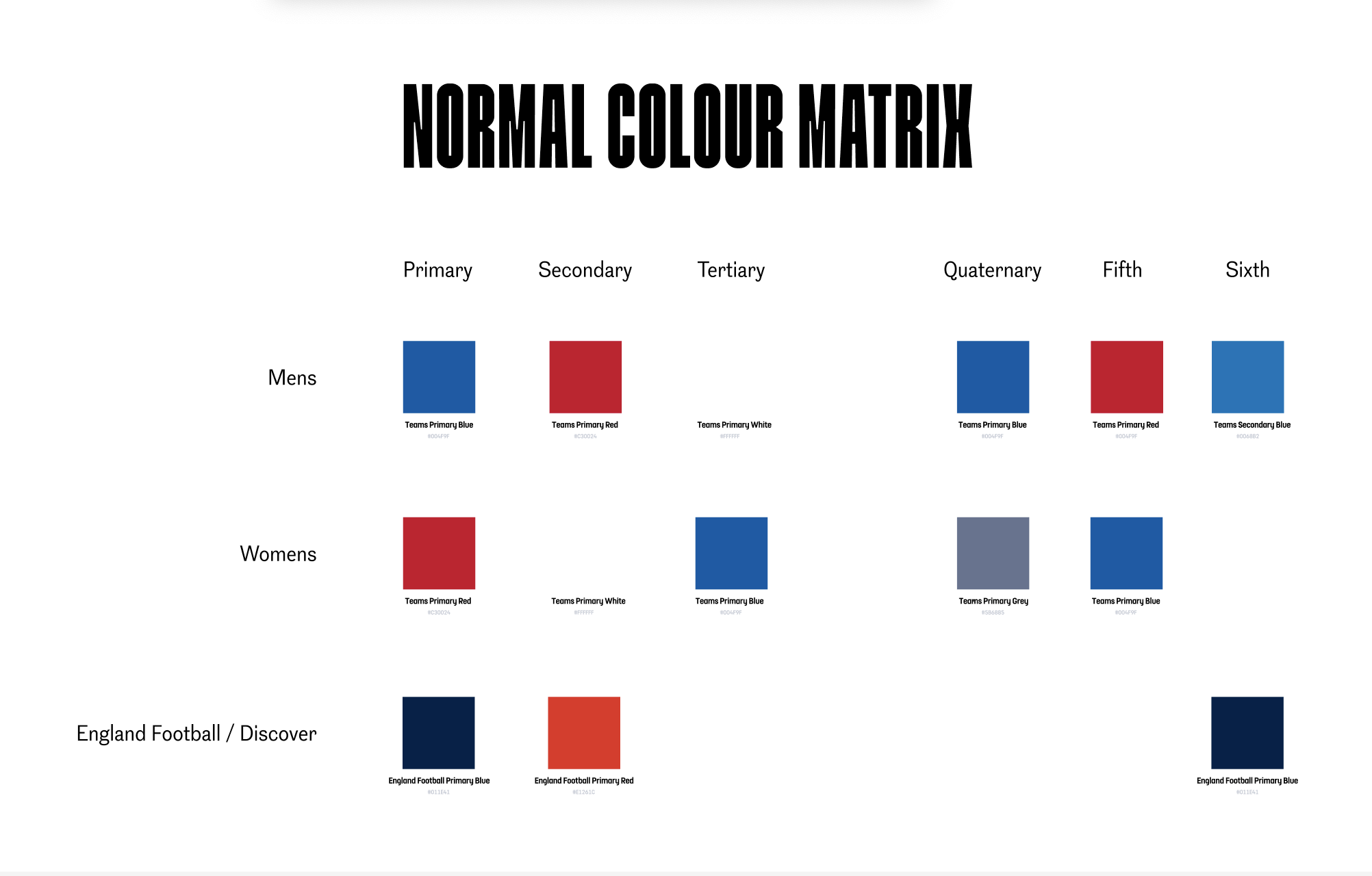
The Figma file visualises the branding well, an example being this Colour Matrix:

This shows the value of each property in each brand. From this, we can see that “Primary” in the Men’s branding is blue, the same value is red in women’s and it’s dark blue in England football.
Implementation
Branding properties are set, based on their parent context. We can change that context by adding a data-brand attribute to our markup. The options available, are: [data-brand=mens|womens|englandfootball]. If no brand is set, it will default to englandfootball.
Changing the brand
The brand can be changed for the whole page by changing the attr on the top level item, or it can be changed for a specific section by adding the data-brand attribute to a wrapper.
<div data-brand="mens">
  Anything in this div will use the men's branding.
</div>
Colours
Colours can be referenced using a reference to the colours set in static/src/styles/tokens/colors.scss
.branded-color {
  color: var(--brand-primary);
}
Text
We have 5 different heading styles that are branded and one paragraph style. These are set as sass variables and classes that can be extended. They referenced in: static/src/library/components/text/brand-headings/brand-headings.scss.
.my-heading {
  @extend .heading-1;
}
When not to use branding
Most of the properties that live within branding (like the font-family or specific colours) live within the repo as a sass variable. Sometimes, we will want to use a property that matches a brand property, but shouldn’t change contextually. In these cases we can reference the sass variable to make sure it doesn’t change based on the branding. The UXD team should be able to help understand where branding should and shouldn’t be applied.
How it works
Branding properties are set using CSS
variables. By default, these variables
are set at the :root to the England Football branding.
We then have selectors for each of the brands that change the value of the variables.
static/src/library/components/text/brand-headings/brand-headings.scss
This means that we can nest branding to create new effects (like on the homepage), like:
<div data-brand="mens">
  `var(--brand-primary)` is now blue

  <div data-brand="womens">
    `var(--brand-primary)` is now red
  </div>

  `var(--brand-primary)` is now back to blue
</div>
Colours
The brand colours are a lot smaller in scope, and you can see all the settings within: static/src/styles/tokens/colors.scss.
We have up to 5 different colours for each brand.
We als have some RGB values (that look like this: --brand-primary-rgb: 1, 30, 65;), which allow us to create transparent versions of the brand colour, like: color: rgba(var(--brand-primary-rgb), 0.5).
At the moment, the Team brandings (mens / womens) have 5 colours, where the England Football brand only has 3. This means that there is no fallback for those colours when using the EF branding.
The colours file also contains a supplementary brand definition. This has been created for the Homepage, where there is slightly different branding for one of the tray sections. This isn’t intended to be reused across the site, but there isn’t any reason why we couldn’t - we may just want to make the name clearer.
Fonts
Branding for fonts is a little more complicated than colours, because we need to associate more types of properties (font family, font size, weight, etc). Branding is still applied in the same way, but we divide the brands into two fonts:
- England Football (default) which current uses
FS Dillon - Teams which uses
England FCandGrot12fonts.
In this case, when we talk about “Teams” we are referencing both the Men’s and Women’s brands as they both use exactly the same fonts.
To achieve this, we have a fair bit of set up:
- We have 5 different heading sizes within the branding
- We create CSS vars for each property that can be branded within those headings. (Like
--brand-heading-1--font-size, --brand-heading-1--letter-spacing) - We set these values for England Football and Teams brands in
static/src/library/components/text/brand-headings/brand-settings-ef.scssandstatic/src/library/components/text/brand-headings/brand-settings-teams.scss - We also change the values of these variables based on media query, so we can have a mobile and desktop size without having to write the media query each time.
- To make implementation easier, we then combine all these variables into a sass variable and create heading classes that can be extended. This can be found in
static/src/library/components/text/brand-headings/brand-headings.scss
All this means that we can extend the heading class like:
.my-heading {
  @extend .heading-1;
}
Note: We don’t set any colours on the brand headings. because these vary based on context.